
Steve Goldstein’s Amplifi Media works with media companies and podcasters in developing audio content strategies. Goldstein writes frequently at Blogstein, the Amplifi blog. Steve can be reached directly at 203-221-1400 or sjgoldstein-at-amplifimedia-dot-com.
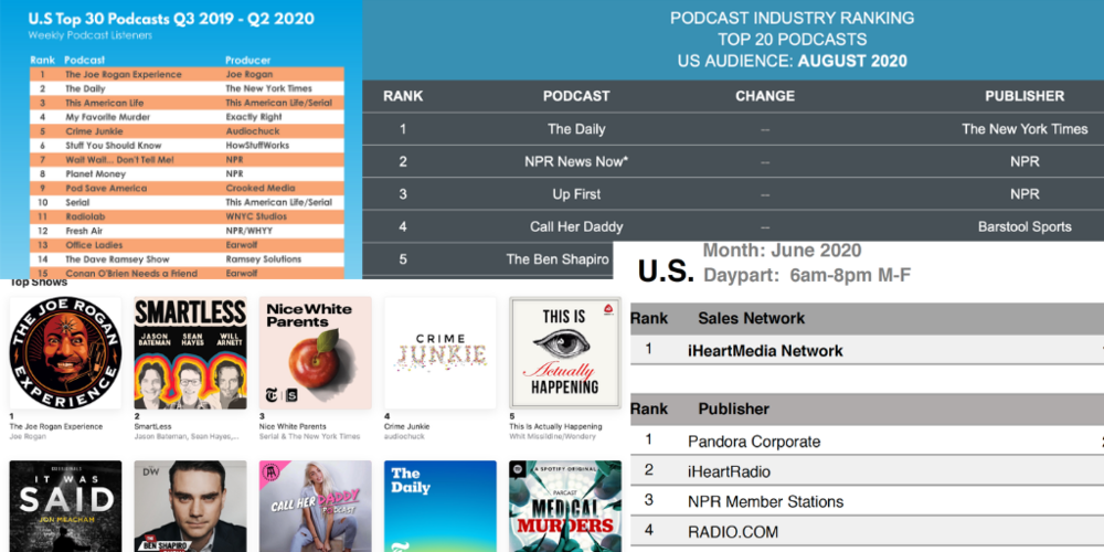
What is the most popular podcast? Is it Joe Rogan? The Daily? Michelle Obama? And who is the number one podcaster? is it NPR? Or maybe iHeart? The answers depend upon where you look and that can be confusing and maybe even misleading.
There is Nielsen for TV and Billboard for music, but no single currency or chart authority exists in podcasting. Over the last year quite a few charts popped up in the marketplace ranking shows and podcast networks. Due to a lack of consistency, these charts often have confusing and conflicting information.
 The reason why there is little consensus between podcast rankers is because each one measures something different, and some require the participation of podcast publishers to share data. In short, no two podcast charts use the same methodology. Each has its own formula using one or more key metrics, including downloads, plays, streams, and listener recall.
Those are very different things. Grab your scorecard.
-
Downloads – Downloads as a metric, while flawed, remain the closest to currency and a frustration for content creators and advertisers.
A chart measuring downloads of podcasts often collects data provided from a podcaster or podcast network. These charts have participants that opt-in to be included, and only a handful have chosen to participate in more than one chart.
If you are a podcast listener, you’re well aware that not everything you download is listened to all the way through if listened to at all. So, why downloads as a metric? Since the inception of podcasts, Apple has dominated the scene and still does. According to Libsyn, Apple captures 65% of the market. Apple remains notoriously stingy with data; they share download numbers and little more.
-
Actual listening – Ideally a chart should reflect real listening including when the listen has occurred and the length of the listen. This scenario is the holy grail, and while most publishers can track some listening outside of the Apple eco-system, right now only Spotify collects and reports actual listening data.
-
Listener recall – A chart that ranks podcasts based on listener recall is compiled from research surveys, usually conducted online, which ask podcast listeners which shows they have listened to over a specified period. The value here is these surveys don’t require publisher participation, so they represent a full view of all podcasts from any source.
“A download is not the same as a listen”
Which chart is right? All of them?
Some guardrails worth noting:
-
A download is not a listen – Repeat after me; “a download is not the same as a listen.” My podcast app is loaded with podcasts I never seem to get to.
-
Many podcast charts only feature clients that pay them – There is nothing fundamentally wrong or evil going on here, just a giant and important FYI, asterisk and hmm. Two of the most quoted charts are Podtrac and Triton and yet they share only six clients (see chart), which means there are significant differences.
-
Chart stats are often boosted by extra feeds or trailers – If you have downloaded a “new” episode of a podcast only to find its content is a trailer promoting another podcast, that falsely enhances the number of downloads of the podcast you subscribe to. For example Wondery’s Dr. Death feed may be used to help launch a new series, or if iHeart runs a promo for a new series on 470 podcasts – that’s how many they have – that’s a lot of extra downloads and plays.
-
Spotify does not participate in any charts other than the native ones in their app. So you won’t see exclusive content such as Michelle Obama’s podcast or Bill Simmons or Gimlet represented on other opt-in charts. Also given the lean toward younger users on Spotify, that may influence the podcasts that perform best.
Here is our downloaded, uploaded, processed, raw count, balanced, smoothed, prepended Chartapalooza view of some of the charts:

Amplifi Media September 2020. Sources: Podtrac Top Podcast Publishers U.S. Audience, July 2020, Triton U.S. Top 15 Networks July 6 – August 2, 2020
These two charts require customers to add codes to podcasts or submit files to the chart publisher to participate which can yield very different data. Only six publishers, NPR, Wondery, NBC News, Cumulus/Westwood and Warner Media appear on both charts. Amplifi Media September, 2020
Podtrac – The longest running and most established, the Podtrac chart measures downloads by putting a small piece of code in front of every podcast that participates in the Podtrac survey. Not all aggregators or podcasters subscribe to this service which is a requirement to be included in the ranking. Two big ones, Stitcher and Cadence 13 are notably absent . As a result, it’s a slice, albeit robust, of the podcast universe.
iHeart – From time to time we see charts from iHeart which skew heavily toward the publisher. They are likely showing us podcasts consumed on the iHeart app, which represents a fraction of the overall podcast market.
Edison’s Podcast Consumer – This is a tracking poll, meaning it is continually updated and refreshed using an online sample that asks people to recall their listening. While it doesn’t measure downloads or actual listening; it is however a ranker of any and all podcasts. Edison releases a list of the top 30 podcasts to the public quarterly. Any additional data requires a subscription to their service.
Triton – Similar to Podtrac, this monthly chart is comprised primarily of download data tracked by Triton’s Podcast Metrics measurement service. This chart also only ranks the shows and companies that opt-in for the service.
Spotify – Spotify’s charts are intended to drive podcast discovery, and rank the top 200 shows overall, top 50 in specific categories, and the top 50 trending podcasts. These charts are updated daily and reflect actual listens on the Spotify platform, which represents around 10% of all podcast consumption. These charts are the only ones that measure actual listening but is subject to cross-promotion efforts within the Spotify app.
Media Monitors – This company has a great reputation for monitoring the ads and music played on radio and TV stations as well as the ads of various print publications. They have a nascent service for podcasts which measures recall from an online panel. Right now they publish data occasionally. We will see where this goes.
Chartable – This well regarded tech company appends some code to 5,000 podcasts and measures downloads.
Apple – Apple produces two charts and they are different. “Top Shows” has some Apple never-published “secret sauce,” but at its essence measures the momentum and subscribers to a podcast, while “Top Episodes” is more dynamic and actually measures listener consumption. By the way, even podcasts that are “streamed” via Apple apps are considered downloads. Many people listen to a podcast but do not “subscribe.”
“Subscribe” numbers are funky. IP addresses can be unreliable if someone listens on multiple devices in various locations.
“Subscribe” numbers are funky. IP addresses can be unreliable if someone listens on multiple devices in various locations. And while the IAB V2 standards have helped a great deal to standardize things, there are issues of consistency. Our friend and editor of Podnews, James Cridland has a useful deep dive here.
While each chart offers windows into consumer preference, none give us a definitive view. That’s not necessarily good, but it is part of the growing pains of any nascent business.
At this rate, pretty soon, we’ll need a new chart that ranks the rankers.