Is the world returning to normal life? There are many answers to that question. One set of answers can be derived from information released by Apple.
The company has released a fascinating dataset of mobility information, covering the period from January 13 to June 8. The info comes from Apple Maps, and carries three trendlines: Driving, Walking, and Transit.
Here’s what the lines look like for all of the U.S:
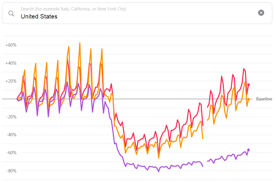
Purple = Transit / Yellow = Walking / Red = Driving
This thing is interactive, and you can play with it HERE. Enter any city or country you can think of in the world, and Apple will pop up the mobility data for that city. Details differ among them, but the basic shape resembles the U.S. curve above. Interestingly, Transit lags way behind, while Walking has reached back up to normal in the U.S.
When it comes to audio businesses, “return to normalcy” includes pre-Covid routines, especially commuting which is a key listening daypart. These charts don’t answer that question specifically, but they point toward it.
Along with the interactive tool, Apple publicly released all the data in a 3,600-row spreadsheet that marches through each day of the 1/13 – 6/8 period. It is fascinating to microscopically examine how mobility changed day by day in just about any location you can imagine. But broad insights are hard to ferret out from that sheet — as noted above, it’s the general curve which matter.