


A few highlights:
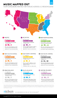
- The Pacific coast streams music to a greater extent (51.3%) than any other region. That population also pays for music streams more than other populations (7.5%).
- Conversely, the northern-middle part of the country takes least advantage of streaming, at 37%.
- In every region, the car radio is the most-used listening medium, and PCs are the second-most preferred. Only the third-most used device is up for grabs throughout the U.S.
- Speaking of that third device, the East South Central region (including Mississippi, Alabama, Tennessee, and Kentucky) uniquely prefers the TV as the #3 music medium.
- When it comes to music discovery, radio comes in first everywhere, followed by friends. Here too, it’s the third choice which varies. the most popular #3 venues are YouTube and Pandora. but in East North Central (surrounding the Great Lakes), it is movie soundtracks.
- In each region, a population majority listens to music as a “primary activity.” In the Mountain region (the huge swath around the Rockies), that’s true for 80% of people, the leading region for that metric.