


SoundCloud announced an upgrade to its browser experience that brings a more visual music player onto the screen. RAIN first reported the “visual player” in January — users saw that new design when SoundCloud tracks were embedded in other websites. SoundCloud also updated its iOS and Android apps with the larger, more graphic player. Demonstrating that it is a mobile-first company, SoundCloud left the website update for last.
SoundCloud’s stated goal is to compete with YouTube as the premium audio platform. As such, it makes sense to be as visual as possible. Video content becomes viral more readily, and generally attracts more audience, than pure audio content. SoundCloud’s visual player is not a container for video, or even for slideshows (which are in many YouTube videos), but it does give listeners something to look at.
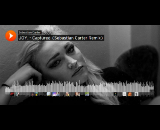
Although the player is not new, its placement on the website has SoundCloud creators up in arms. (SoundCloud, like YouTube, is a crowdsourced content site, originally founded as a storage and collaboration platform for musicians.) The main complaint is that SoundCloud uses the creator’s thumbnail image for the greatly expanded player image, cropping it to new dimensions, and making low-resolution thumbnails look pixellated in a larger size.
We eavesdropped in a SoundCloud creator group on Facebook, and found the reaction to be negative. Public comments (by creators) on SoundCloud’s announcement page are wholly negative.
In preparing this write-up we looked at dozens of track pages with the visual player, comparing to the thumbnail images which still exist in track-list pages. While it is easy to find some unfortunate results, we also found many gorgeous translations of thumbnail to the big image. Fastidious creators will choose thumbnails that look good in the larger format, and take advantage of the more attractive listener experience which now exists across the entire SoundCloud ecosystem.