 Dan Misener is Head of Strategy and Audience Development at Pacific Content. This guest column was originally posted on the Pacific Content blog (on Medium).
There are trends in book cover design.
There are trends in movie poster design.
And, of course, there are trends in podcast artwork design.
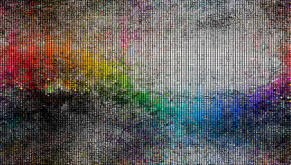
This week, I looked up the top 200 shows in each of Apple’s podcast categories, and downloaded each show’s cover artwork. After removing duplicates, I had 11,697 individual pieces of artwork.
Then I sorted them by color.
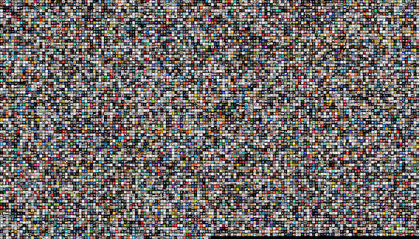
Unsorted above, sorted by color at the top.
With this birds-eye view, we can easily identify artwork color trends (and tropes). Let’s zoom in and look at a few, shall we?
Red background with light text
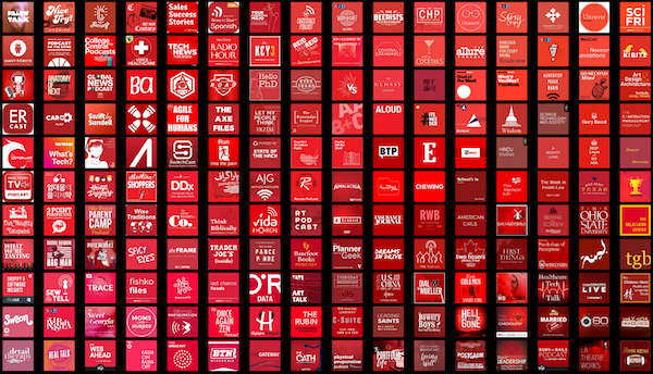 Red is often associated with lust, power, excitement, love and anger. According to the branding agency Iconic Fox, it “creates a sense of urgency which is why it’s effective with sales.”
In podcast-land, we see red used across a wide variety of show types, including true crime, music, history, heath, kids, shows from brands, and more.
Blue background with light text
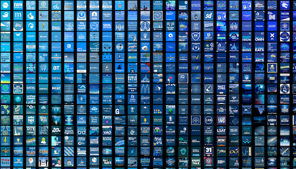 Blue is the color of competence and quality. Iconic Fox says it evokes trust, loyalty, dependability, logic, serenity, and security. It’s also the color of “corporate.”
Blue is another very prominent color in our birds-eye view of popular podcast artwork. With so many shows using this color scheme, it can be difficult to create something visually distinctive.
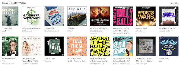
Yellow background with dark text
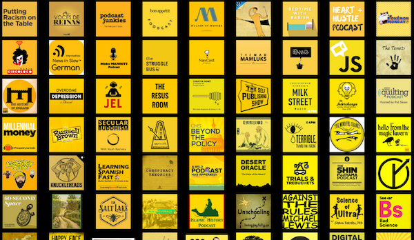 As designer James Verdesoto says, “Yellow is a cheap way to catch the eye.”
Yellow pops, especially against a sea of less-eye-catching colors. Just look at how Against the Rules with Michael Lewis jumps out from the pack in Apple Podcasts:
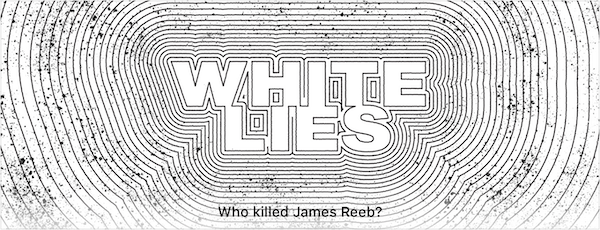
 Low (or no) color
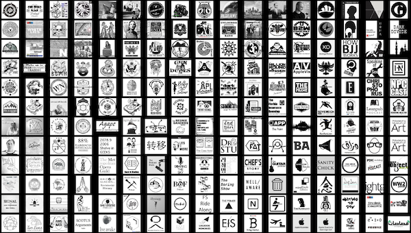 Some podcast artwork deliberately eschews color, and goes for a black and white or greyscale look. One recent example is NPR’s White Lies, which manages to be eye-catching (in part) due to its absence of color.
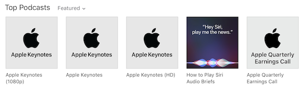
 Also worth noting: many of Apple’s own podcasts take a low/no-color approach to show artwork:
 Why does color matter?
Podcast artwork is part of your show’s product packaging.
According to 2006 research by Satyendra Singh, color is a powerful driver of first impressions:
People make up their minds within 90 seconds of their initial interactions with either people or products. About 62‐90 percent of the assessment is based on colors alone. So, prudent use of colors can contribute not only to differentiating products from competitors, but also to influencing moods and feelings — positively or negatively — and therefore, to attitude towards certain products.
Podcasting is crowded, and it’s getting more crowded by the day. With 700,000+ shows out there, it’s never been more important to stand out from the crowd.
What color(s) does your show use? Why?