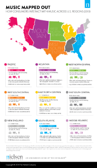
 Nielsen posted a fascinating infographic called Music Mapped Out that carves the U.S. into regions, and analyzes how their populations listen to, and pay for, music. The infographic is here, and we recommend it highly for an interesting view of music consumption. Infographics can be a terrific way to convey lots of knowledge concisely, and this one is a winner.
A few highlights:
- The Pacific coast streams music to a greater extent (51.3%) than any other region. That population also pays for music streams more than other populations (7.5%).
- Conversely, the northern-middle part of the country takes least advantage of streaming, at 37%.
- In every region, the car radio is the most-used listening medium, and PCs are the second-most preferred. Only the third-most used device is up for grabs throughout the U.S.
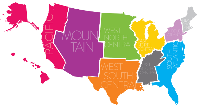
- Speaking of that third device, the East South Central region (including Mississippi, Alabama, Tennessee, and Kentucky) uniquely prefers the TV as the #3 music medium.
- When it comes to music discovery, radio comes in first everywhere, followed by friends. Here too, it’s the third choice which varies. the most popular #3 venues are YouTube and Pandora. but in East North Central (surrounding the Great Lakes), it is movie soundtracks.
- In each region, a population majority listens to music as a “primary activity.” In the Mountain region (the huge swath around the Rockies), that’s true for 80% of people, the leading region for that metric.